

How (and why!) to Use a Heatmap on Your Blog
Have you ever worked painstakingly on a blog post with the perfect opt-in and then gotten feedback from others that they left your page confused? Or maybe you wonder why one of your posts gets more traffic than others?
If this sounds familiar (*raises hand*), then it is time to learn how to use a heatmap for your blog.
What is a heatmap?
A heatmap is a visual representation of what users do once they are on your site. This tool gives unique insights into audience behaviors such as where they clicked or scrolled or spent more time.
Basically, a heatmap shows you which parts of your page receive the most attention and it also gives indicators of what might be confusing or at what point your readers click away.
How to use a heatmap on your blog
Heatmaps provide much-needed insight into how users are reacting to certain features, letting you know which elements of the design are working and which aren't.
If you have a pop-up that people leave immediately upon seeing, a heatmap can tell you this! As you collect data, you may find your pop-up is actually doing more harm than good.
Essentially, heatmaps let you harness powerful data from user behavior to help your blog gain traction. A heatmap is an analytical tool that shows how users interact with content on a page, such as clicks, hovering, or scrolling.
It puts the data right in front of you so you can see how users are engaging with your content. This gives a clearer idea of what works and what doesn’t. As a result, you can optimize your site in the best way possible to help your audience.
Landing Pages
Imagine if you could see what a user does once they reach your landing page or sales page.
Are they hovering, scrolling, and clicking where you want them to?
If you see their behavior, you can remove distracting elements and rearrange others to increase your conversion rates.
Knowing where your readers are drawn to tells you what you need to focus on. If you see they are clicking on your sidebar often, make sure you optimize your sidebar to make the most money possible!
This may mean removing network ads, depending on your situation. I removed all ads from my site because they don't offer the best user experience, and because I can make more money with my own products.
High-traffic blog posts
Another area where you might want to include a heatmap is on a high-traffic blog post. Are your users spending a lot of time on the post but not converting?
At what point are they clicking away? Were are they trying to click to get more information? Optimize that post based on heatmap data for even better results!
Which metrics are most important to track?
Heatmaps for blogs show three main behaviors: scrolls, hovers, and clicks. Once you understand these behaviors you'll understand why using a heatmap can be so useful.
The color scheme on a heatmap is like weather radar or infrared cameras – more activity correlates to a redder color.
Scrolling
Scrolling and click data are the main reasons why you should use a heatmap.
Scroll data tells you at what point your reader navigated away – whether they lost interest in your content or simply got distracted (maybe by one of your ads…).
Are they dropping off before they even see your call to action?
Are they getting distracted by pop-ups or items in the sidebar?
Do they scroll quickly through the main content looking for an answer to a specific question?
Hover
Where are your readers spending time? A hover heatmap shows if they are on your main blog post or content versus other objects that might be on the page.

With the heatmap I use, there's a way to watch videos so you can see in real-time (well, pre-recorded) how your users interact. This shows me how long they hover over something.
With hover data, it's important to discern true hovering versus someone who got distracted and just left their mouse in one place. The larger your audience, the more accurate your data from a heatmap will be.
Clicks
So far, my favorite data has been click data! Click data shows you where people are – you guessed it – clicking on your content.
Are your readers trying to click on a graphic or element that isn't even clickable?

A click heatmap shows you – at a glance – what your readers are most interested in. I thought my people would be excited to read about my $7/mo blog coaching, but after 100+ clicks, not a single person clicked on it!
I was surprised, but I didn't make a change – I like to wait until I have more data first. Perhaps the $1K Challenge distracted them. That is one reason most bloggers suggest you only have one clear call-to-action in a footer.
Heatmaps can even show you rage-click clusters. Rage clicks happen when a link isn't working properly or users get frustrated thinking something is a link that isn't. Fix these frustrating areas with heatmap insights to improve the user experience.
Improving your reader's experience is one of the keys to ranking higher on Google.
How much do heatmaps cost?
Like most blogging tools, heatmaps run the pricing gamut from free to $40+ each month. I recommend starting with a free program such as Microsoft Clarity. It's simple to install and easy to use.
I am not getting paid for mentioning or using them, and I'm not an affiliate (unless you count my affiliation for the Creator Program)! I just really love this free resource! 🙂
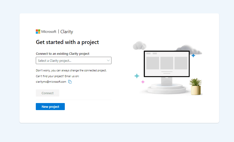
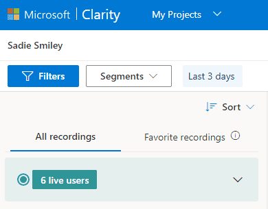
How to install Microsoft Clarity free heatmap
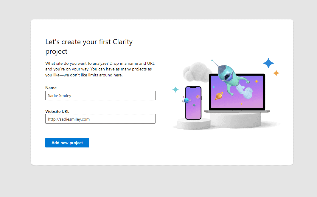
- Navigate to Clarity's website and click Get Started.
- Choose Create to get started on a project.
- Choose how you want to install Clarity. I chose install on a third-party platform (WordPress).
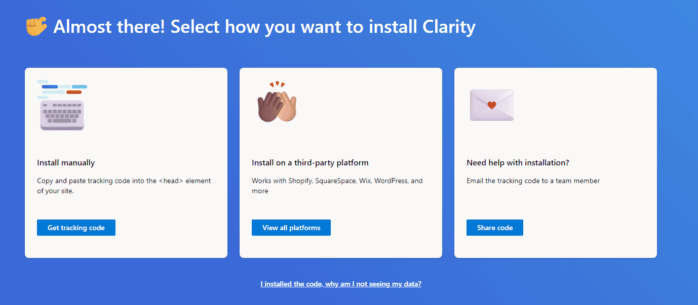
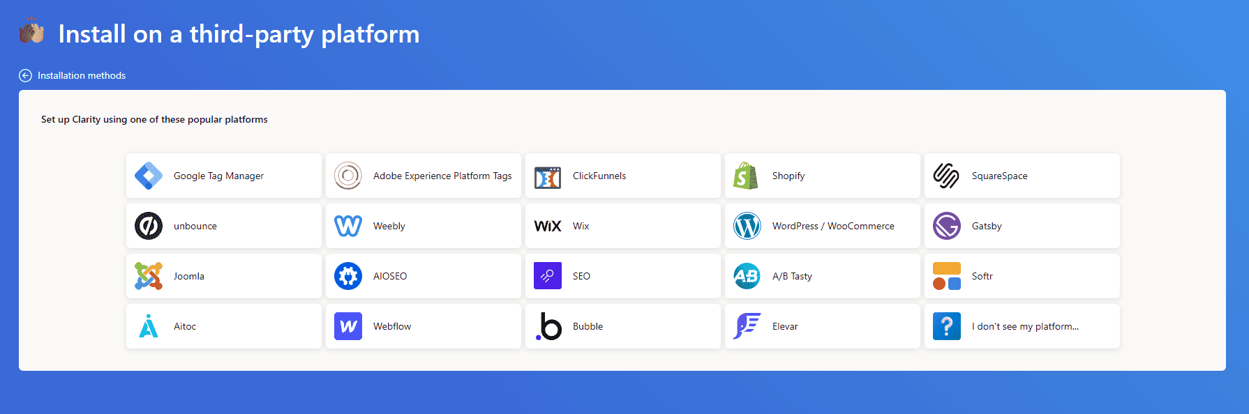
- Microsoft Clarity can currently be installed on all the platforms below. If yours is not listed, choose Install Manually in the previous step. I am using WordPress.
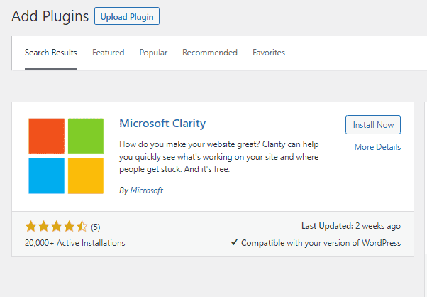
- Next, grab the Microsoft Clarity plugin for your WordPress site.
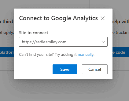
- Once you have the plugin installed on your site, connect it to the project you initially created. You will also connect Clarity to Google Analytics.
- Navigate to Settings.
- Connect to Google Analytics. Clarity gives a visual representation alongside all the other insights you get in Google Analytics.
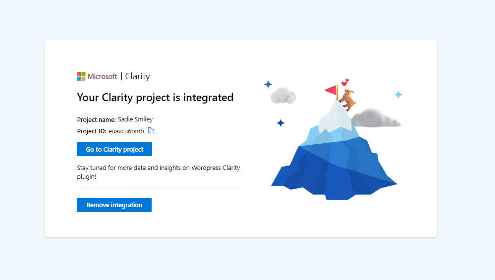
- Once everything is set up, you will get a screen that says your project is integrated.
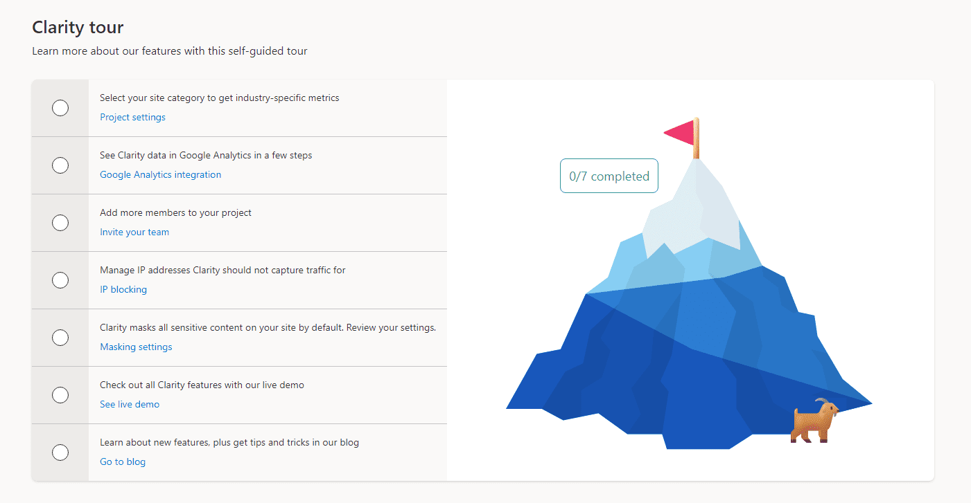
Be sure to take the tour of Clarity to fully understand all the insights at your fingertips.
In addition to the heatmaps, Microsoft Clarity shows you session recordings. Again, this is a useful way to see how users are navigating your site and what is grabbing their attention.
Your Clarity dashboard is immediately accessible and starts pulling data right away. However, it might take some time to get useful insights depending on your traffic.
What Insights can I see in Microsoft clarity?
Once you've given clarity a chance to collect data, your dashboard will start to populate. You can access data such as:
- heatmaps
- sessions
- engagement
- most popular pages
- locations (countries)
- pages per session
- device types
- and more
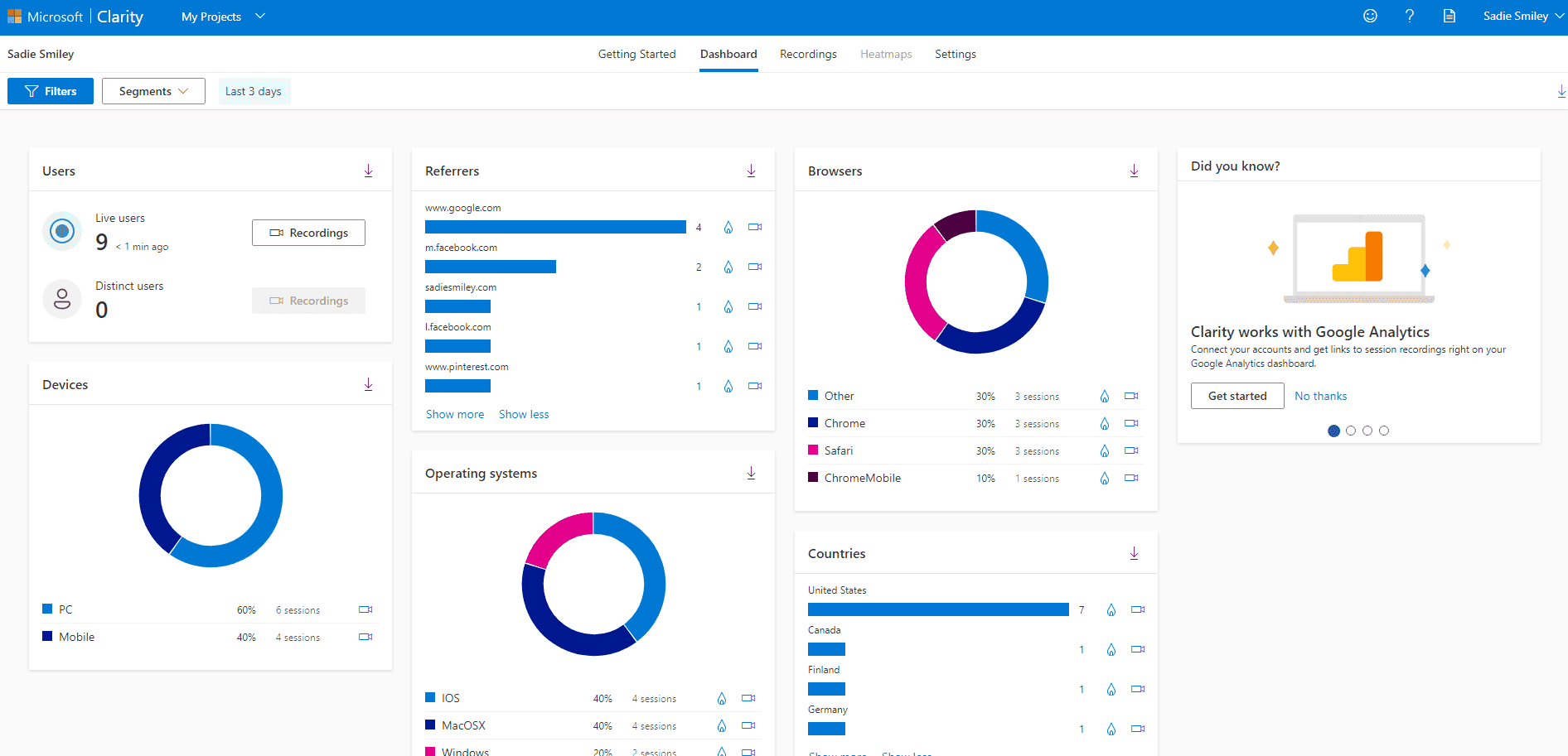
Clarity is a powerful behavior analysis tool. If you are getting consistent traffic, but not seeing corresponding conversion rates, try using a heatmap to pinpoint areas for improvement.
Get the Microsoft Clarity Extensions
I installed the Clarity extension on Chrome. It helps you easily see where and how users engage with your site.

I watch the recordings to see if people are scrolling fast (not reading) or not scrolling at all (moved to another tab, perhaps), and also to watch where they click and how they interact with my page.
This heatmap is like hiring testers to go through your site with a fine-toothed comb and give feedback – but you get it for free, and don't have to interact with anyone. LOL
Is Microsoft clarity safe?
Yes! Clarity is a data tool and therefore must comply with GDPR regulations.
Who should use heatmaps?
All bloggers should use heatmaps!
In order to have reliable and meaningful insights about your site, you need enough data. This means if you are a beginning blogger with 50 page views, a heatmap is not going to give you high-quality results… but this won't take long to change if you follow my six-figure framework.
If I was a new blogger, I would not change or tweak anything major on my website due to heat map data until traffic has increased – but I would install the heatmap to collect data as it comes in.
Once you have at least a few hundred pageviews on the same post or page, heatmap insights can be more useful and consistent.
With a larger data set, trends in user behavior will become more obvious. It will be apparent where people are spending their time and what they are missing out on.
For example, when I looked at my heatmap, I noticed people were clicking on the text next to my call-to-action instead of clicking on my actual call-to-action! What! I never would have known that without a heatmap – and it's a super easy fix. I just made all of the text clickable.

Will Microsoft clarity slow down my site?
Microsoft clarity will not make your site lag or affect performance.
Ultimately heatmaps are another powerful tool in the toolbox for bloggers. First, build your audience by focusing on quality content and true value. Then, use a tool like Microsoft Clarity to drill down where you can help your audience even more and improve their experience.