19 Color Palettes for Your Blog or Business
I love browsing color palettes on Pinterest, but the truth is, my brand colors have been the same for nearly 15 years! I love teal and purple, so I always incorporate variations of those colors. Over the years, I've added in other greens and pinks but I am always drawn back to purple and teal. I'm rebranding again – hopefully for the final time LOL – and am looking at new color palettes. Here are a few color palettes I made in Canva. Feel free to use them for your own blog or brand! 🙂
How to Choose a Color Palette for Your Blog
Whether you love pastel colors, jewel tones, or a mix of the two, these should get your brain jump started to be able to create your own. You can also use them as is! No need to edit. Just pull them over into Canva and set up your Brand Kit.
Here are some to get you started… then check out how to make $100 a day!
Why do blog colors matter?
While your color palette choice shouldn't be something you get hung up on, or something that stops you from being able to move forward and hit “publish”, it is something you should put some thought into.
Your colors shouldn't be too bright (think back to the 90's when we did the black backgrounds with neon colors, whew!), or too boring (beige on top of beige on top of beige). Other than that, there are no hard/fast rules when it comes to choosing your blogging brand colors.
Some things to keep in mind:
- not too bright
- need to be easy on the eyes
Color Theory
Red is a powerful color that can be used to stimulate energy and passion. It's commonly associated with the things we value most: speed, agility and enterprise; which makes it an excellent choice for ecommerce websites as well as restaurants or food delivery apps (like DoorDash) —when you're hungry and ordering your food fast!
Orange is an active color that evokes happiness, optimism and excitement. The intense hue of orange can be used in your web design to show users you don't take yourself too seriously. I love orange because it's bold and loud, and pretty – if you choose the right shade. Burnt orange works well with earthy tones like greens and browns.
The color yellow is associated with happiness and joy. It's a super cheerful, inviting feeling that makes people want to help out. This website’s design would be perfect for service industries such as restaurants or other food related businesses where customer satisfaction should always come first. Don't go too heavy on the yellow, and avoid colors like neon yellow… rarely is that a good color choice.
Green is a great color for any brand that has something to do with health and wellness, or nature. It's calming, which makes it the perfect choice when designing logos or websites in order to cultivate a relaxing environment.
Blue is the most popular color for websites. It has been shown to inspire feelings of trust, making it a heavy favorite in website designs across cultures and industries alike.
Purple, my favorite color, demands attention. It can be used to make websites stand out. It's also bold, confidence-boosting, and creative which makes purple one of the best colors for design options on your site.
Pink is a color that embodies creativity and exuberance. It's been embraced by people of all genders, which has led to an increase in its use across many industries including fashion brands who are incorporating this into their designs
Brown is a warm, earthy color that goes hand in hand with traditional designs. It can be used to give websites an inviting vibe and often appears on sites designed for businesses looking to create the natural feel of wholesomeness or authenticity.
Black is a sophisticated, neutral color that can be used to create an elegant and modern website. Many brands use this dark shade as their key design element because it signifies high-quality products, which may make you hesitate before dropping too much money on something…
White is a color that can be used to create an elegant and simple design. It's often the best choice for minimal web designs because it has no distracting qualities, which means you're able use this shade in combination with other colorful elements easily without clashing or overwhelming one another. White also works well when accenting content through background images.
Gray is a color that says “I’m here to get things done and I won't stop until they're all taken care of”. The tone for this particular shade falls somewhere between subtlety and authority, making it perfect when you want someone else in your organization know exactly who's boss without being overbearing about it.
Pretty Blog Color Palettes
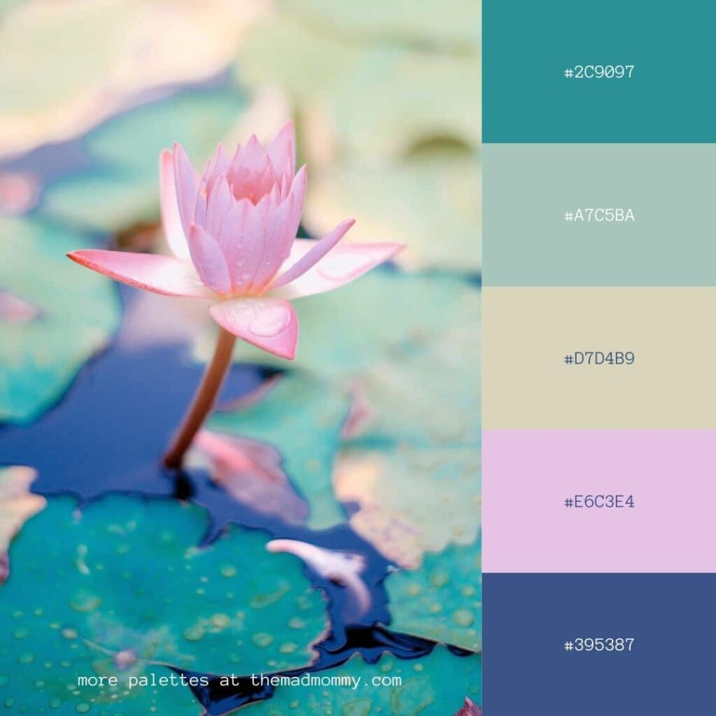
Water Lily Color Palette
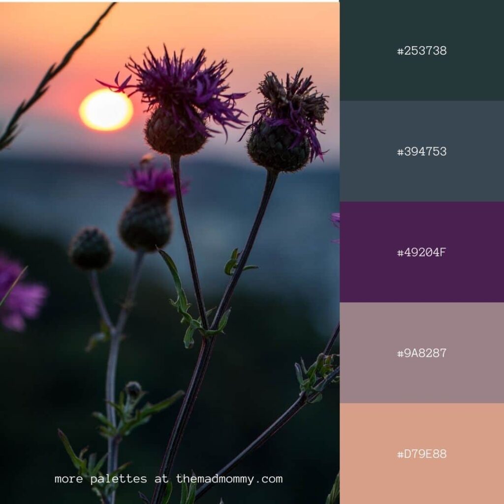
Thistle Sunset Color Palette
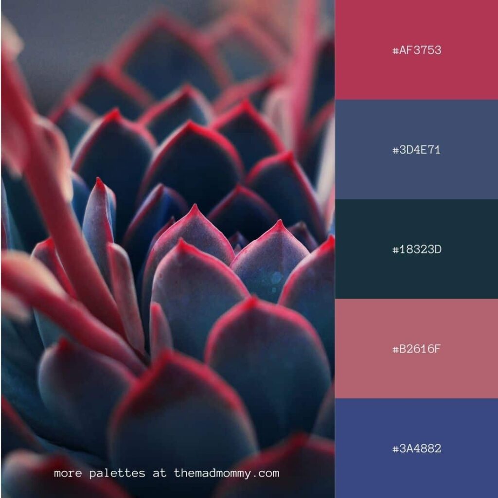
Succulent Jewel Tones Color Palette
Sky Sunset Color Palette
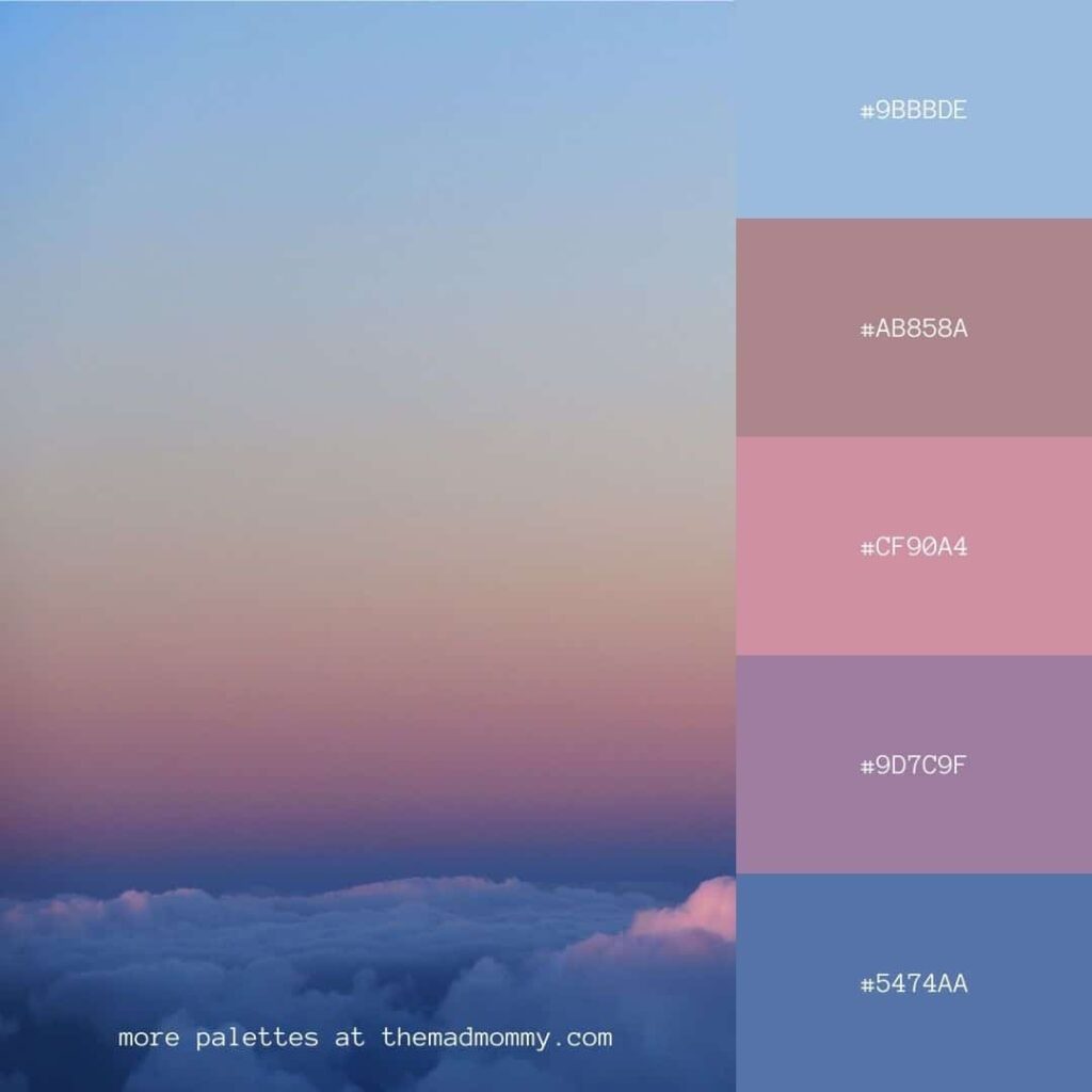
Pink Sky Color Palette
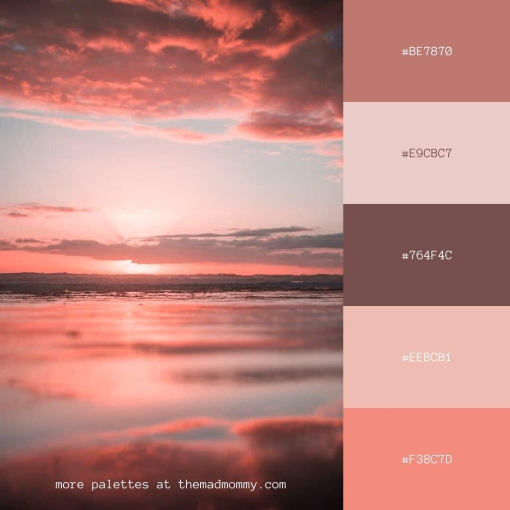
Macarons and Flowers Color Palette
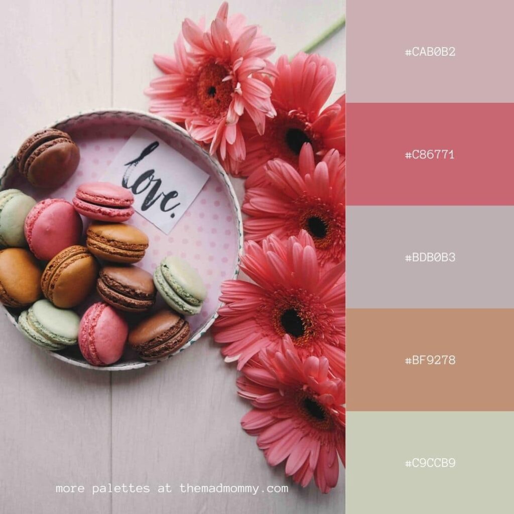
Palm Sky Color Palette
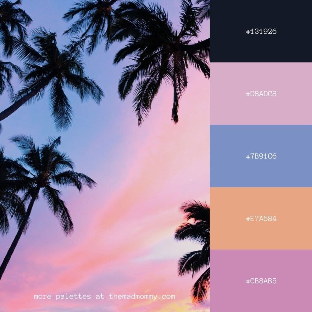
Muted Floral Color Palette
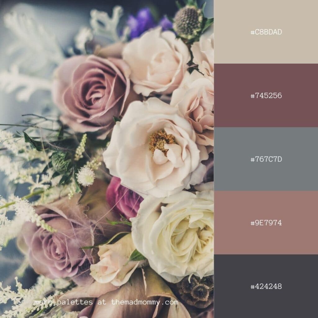
Monstera Color Palette
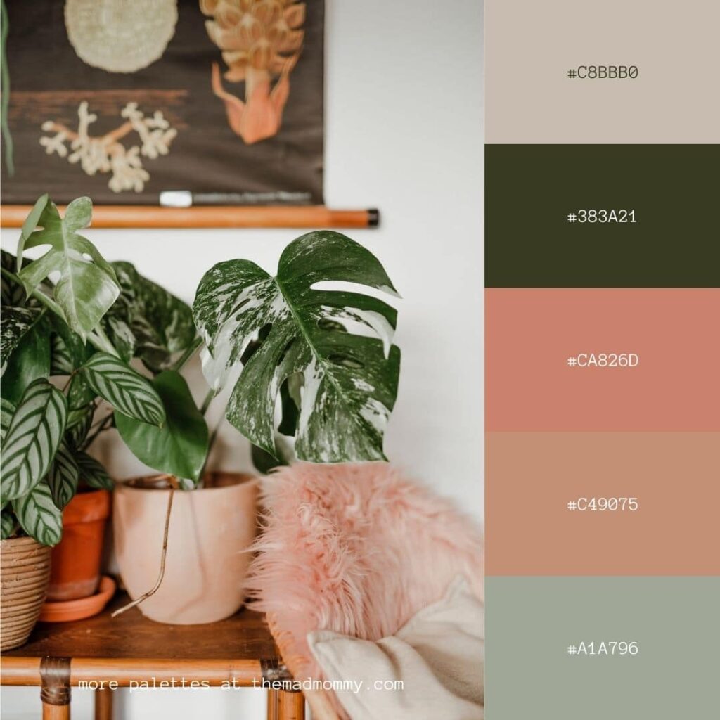
Italian Beach Jewel Tones Color Palette

Hydrangea Color Palette

Herbs and Flowers Color Palette

Golden Hour Floral Color Palette
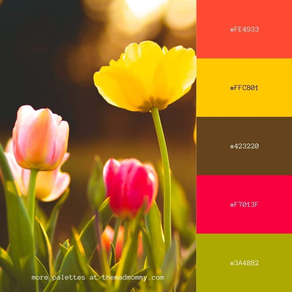
Floral Blossom Color Palette
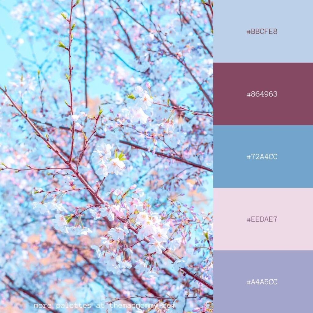
Peony Color Palette

Floral Bouquet Color Palette
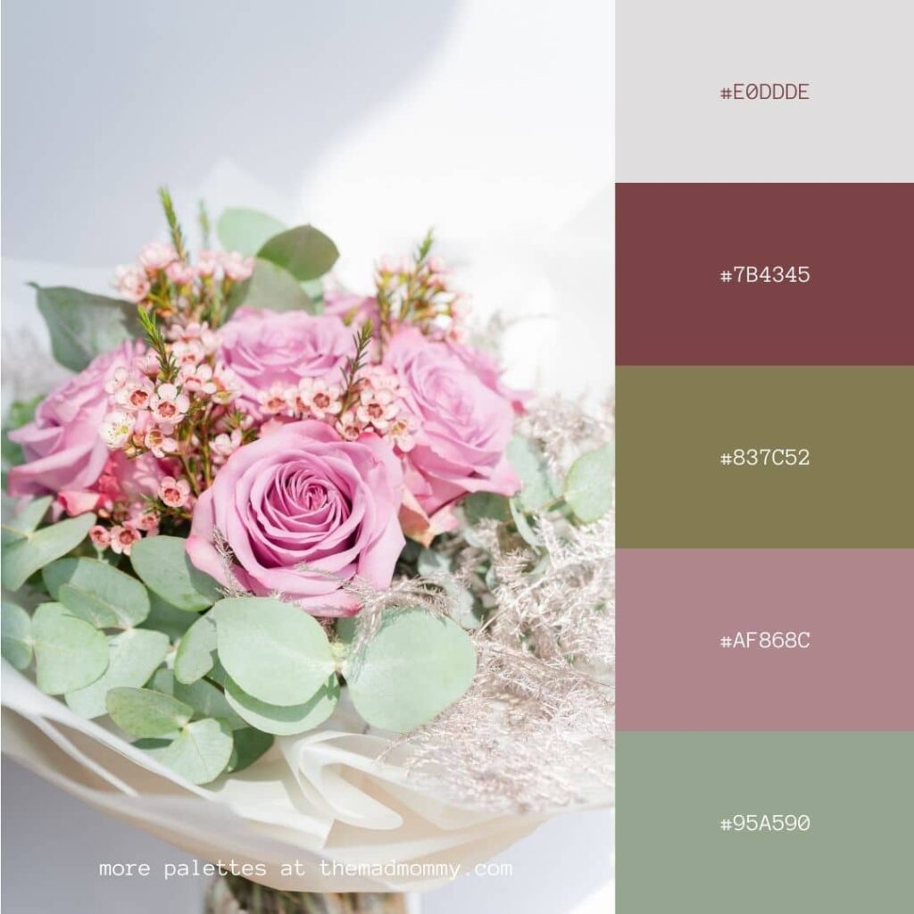
Desert Cactus Color Palette

Dahlia Color Palette
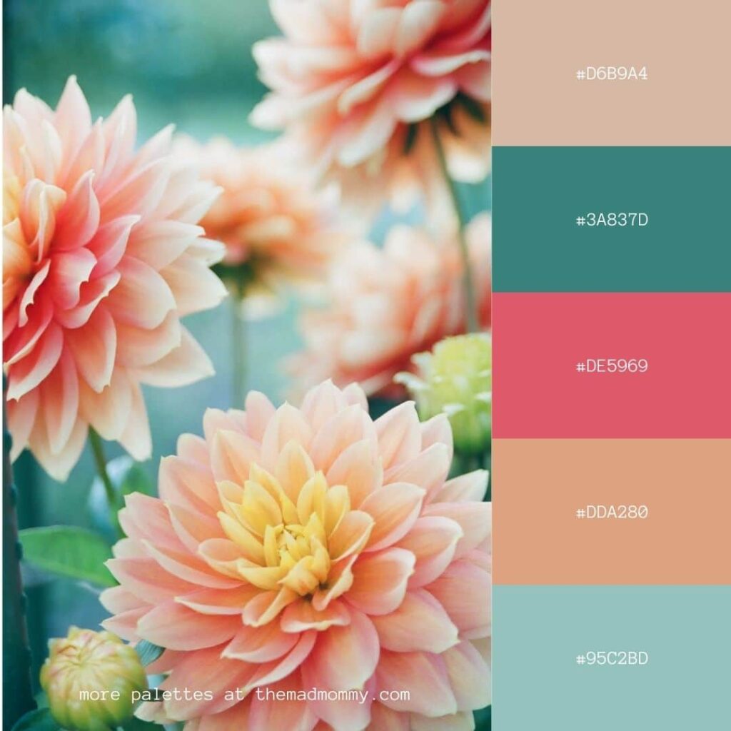
Blood Orange Rose Color Palette
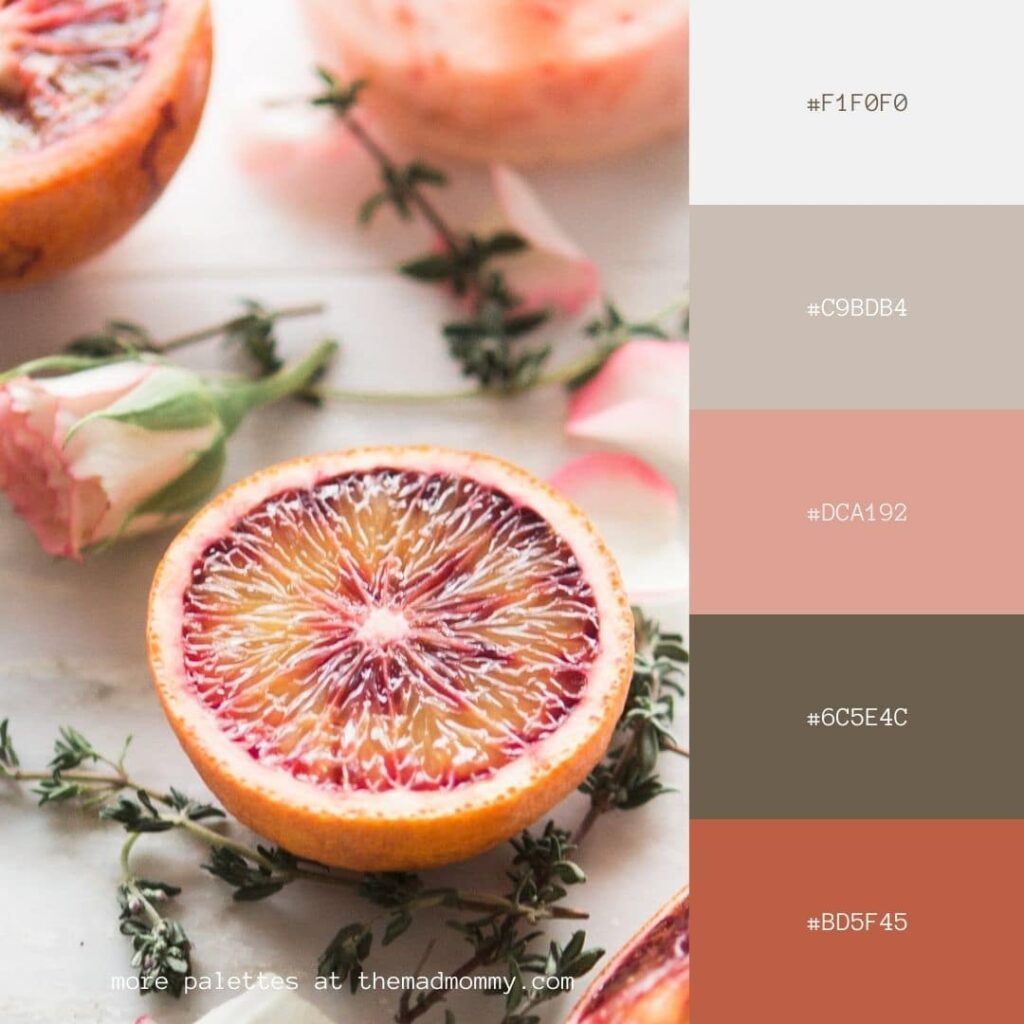
If this post helped you in any way, please pin one of these images below!
It helps my blog tremendously. Thank you!
Setting Up Your Brand Kit in Canva
It's easy to set your brand kit up in Canva after you've chosen your colors! Follow my video tutorial below for a step by step.
